
R&R Smith Organic Tasmanian Apples
2020
2020
R&R Smith is a family apple distribution business established in 1938. The orchard is situated in the Huon Valley, a once thriving apple-growing region that exported apples all over the globe and earned Tasmania the title of the Apple Isle.
As early adopters of organic practices R&R Smith grew to be market leaders in Australia through their innovative organic management, environmentally and socially responsible practices. Rebranding provides the company with additional brand awareness and a platform to allow them to increase their focus on Asian export markets.
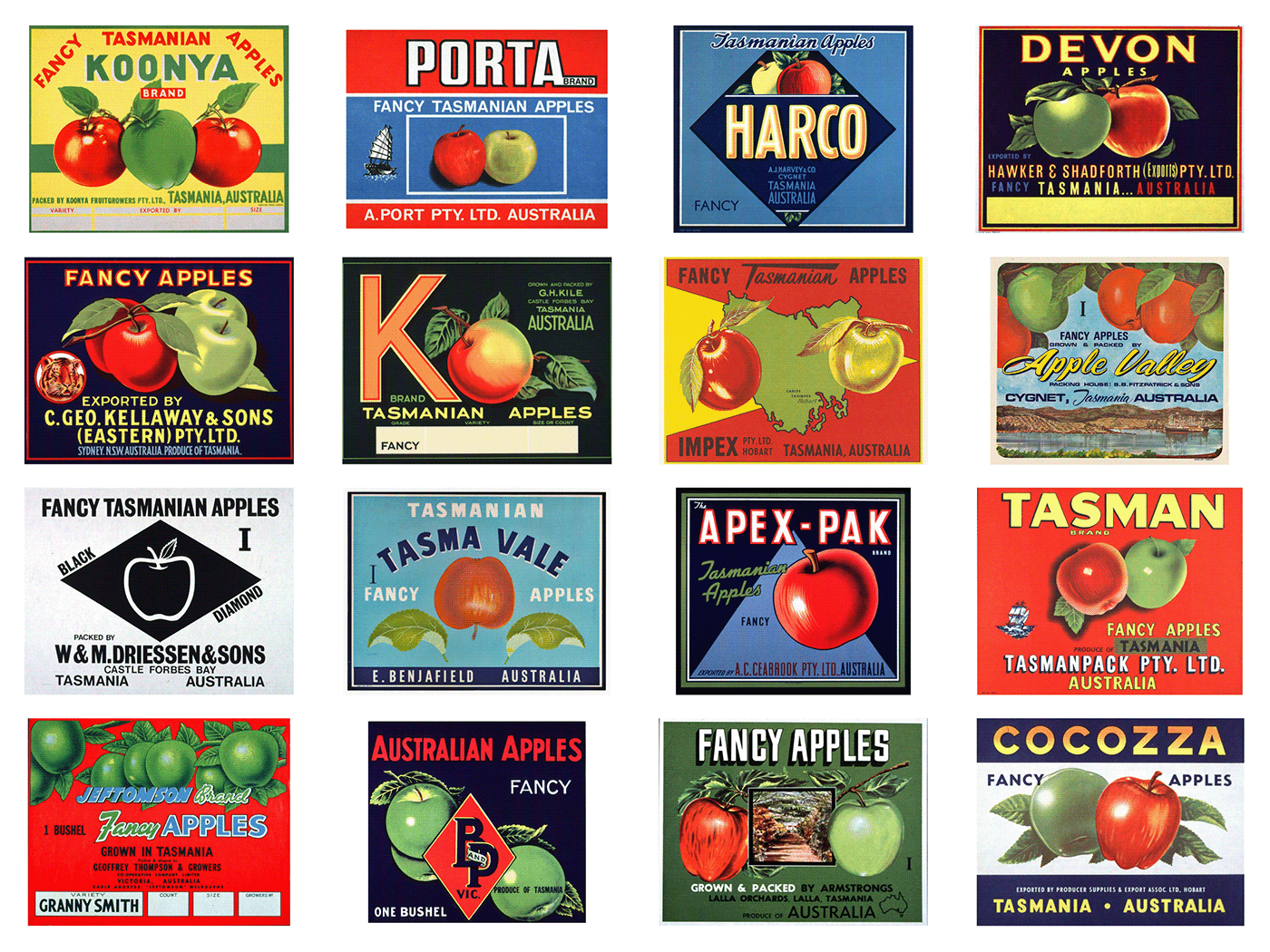
The identity established is a contemporary re-imagining of the golden era of the
Apple Isle. A versatile suite of marks and custom ampersand centre on the apple form. The apple has broad symbolic meaning, including Tasmania as island, fertility and life.
The apple mark emphasises health through subtle gestures to body forms of lungs,
eyes and heart.
Apple Isle. A versatile suite of marks and custom ampersand centre on the apple form. The apple has broad symbolic meaning, including Tasmania as island, fertility and life.
The apple mark emphasises health through subtle gestures to body forms of lungs,
eyes and heart.
Unadulterated colour reflect the intensity of the fruit flavour, the dynamic natural Huon Valley landscape and provides a point of difference and visibility in the organic space. Clear, confident messaging and tactile brand applications using uncoated recycled stocks, compostable plastics
and vegetable inks embody the company values.
and vegetable inks embody the company values.
Client: Andrew Smith on behalf of the R&R Smith family
Brand Identity, Packaging & Print Design: Megan Perkins
Website Design: Mick Fennelly
Marketing: Madeline Myson Consulting
Brand Identity, Packaging & Print Design: Megan Perkins
Website Design: Mick Fennelly
Marketing: Madeline Myson Consulting
Photography: Samuel Shelley
Typeface: Optician Sans
Copywriter: Robbie Arnott
Copywriter: Robbie Arnott
Historic Apple Isle sticker examples:

A selection of brand materials before the rebrand:


